
Chef Tim Says...
| Salad in a Jar Construction Kit | 08/03/20 |
| Cooking: the real aromatherapy | 05/18/20 |
| Get Started Cooking with Stews | 01/09/20 |
| Paella | 07/16/18 |
| How to make your own shrimp stock | 10/09/17 |
| All "Chef Tim Says..." Columns | |
Dr. Tim Says...
| Not So Magic Rice | 04/09/18 |
| Leaky Gut Syndrome Quackery | 10/02/17 |
| 4 ways to protect your brain with diet | 07/18/17 |
| Chicken skin: to eat, or not to eat | 06/19/17 |
| Change is here | 06/12/17 |
| Medical technology | 03/27/17 |
| All "Dr. Tim Says..." Columns | |
Dr. Tim Says....
MyPlate
I have never been a fan of the Food Pyramid. In fact, it always seemed pretty dumb and I suppose that it made sense in the 1980's when researchers were coming to realize the tremendous impact of diet on our health.
It wasn't the first information that our government offered, however. They had been publishing information and literature for decades and the pyramid sought to simplify the recommendations.
The pyramid concept grew out of work in Sweden1 and was adapted by the US Department of Agriculture for the American diet. There were only subtle differences between the pyramid and previous information that the USDA had published. In this poster from 1946 they offered the idea of "The Basic Seven" food groups and guidelines on consumption.
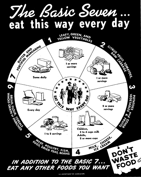
Note the similarity between these seven food groups and the seven building blocks of the Food Pyramid. Even the serving recommendations are similar.
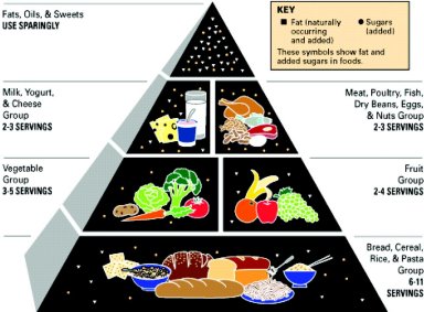
Both of these look great on the surface, so what's not to like?
First and foremost, there was never guidance as to the quality of the foods. All of the choices in the Bread, Cereal, Rice & Pasta group were treated the same and it didn't matter whether you chose white bread or whole grain. The meat group was equally confusing, grouping meat, poultry, fish, beans, eggs and nuts.
Secondly, the servings were somewhat out of whack. The base of whole grains grew out of the belief that a higher carbohydrate, low-fat diet was healthy (although we can forgive that because the research was not the quality of what we expect today). Instead of focusing on fruits, vegetables, nuts and legumes as the foundation, the USDA chose to emphasize bread.
Lastly, the idea that meat, poultry and fish are the same did Americans a disservice, in spite of the efforts of the USDA and nutritionists at the time to distinguish the health differences in animal proteins.
In the early part of this century, the USDA confused the situation even more when they introduced a revision of the pyramid under the brand MyPyramid. This was a valiant effort to improve on a bad concept, with a rainbow of stripes in the pyramid accompanied by steps on the left to signify the need for physical activity. Again, an honest try to help, but rather than making the concepts easier to follow, it just became too complex as this diagram illustrates.
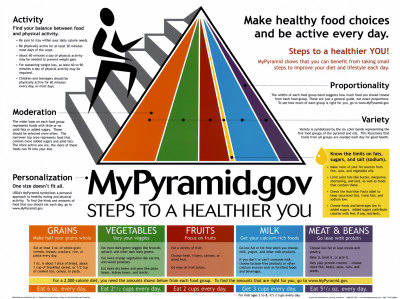
At the time one of my main objections to their efforts was that they bore no relation to what people do on a day to day basis. In the last 30 years since these concepts were developed, people are cooking less and less. As such, the idea of what might go into a "serving" of each of the foods is more challenging and hard to reduce to simple diagrams. How, for instance, does one think about a plate of spaghetti and meatballs inside the pyramid? There is pasta but also likely to be some bread in the meatballs. There's meat but what counts as vegetables - the tomato sauce? This gets even more difficult when you consider a casserole or something like Chicken Pot Pie or gumbo.
The introduction of MyPlate in 2011 sought to reduce the confusion. This is a great effort and joins the idea of healthy serving sizes with how that might actually work on a practical, day to day basis. It's rather simple, really and very much like many of the ideas that have been put forth before about how a dinner plate should be divided. 2

The plate is a visual representation of what your day's consumption should look like. While the plate isn't perfect, it is a vast improvement because it helps show the relative proportions of the individual food groups. As you can see, there is an emphasis on vegetables, grains and fruit,s with plant foods making up the majority of what you should be consuming.
There are some issues with the picture, however. On the one hand, I love the word "Protein," but it needs more detail because this could mean fish, chicken, pork or beef but also other options. Beans, lentils and other legumes, for example. Eggs. Even dairy.
Also, dairy is set aside and the size of the portion is far too large. The image seems to be saying that that you should be consuming as much dairy as other sources of protein. There are those who believe that the amount of dairy suggested by the USDA is motivated by the dairy lobby, and that stands to reason, because the research is clear that you don't need to consume the amount of milk that is recommended.
The other challenge is how to make this part of a whole day's meals. Having whole grains, protein, dairy and fruit at breakfast is pretty easy and familiar. The veggies don't fit as well, however. This can be the challenge at lunch and dinner, as people need to understand how to strike a balance throughout the day. It would have been pretty easy to use the number of daily servings along with the visual revision. I'd include instructions like these:
Vegetables
Most vegetables are not very calorie dense, so almost as many servings as you like. At least three to five per day.
Fruit
Like vegetables, it would be hard to eat too much fruit, but this should be at least three servings per day.
Dairy
One or two servings per day for most people (maybe three at the outside for larger individuals). Only one serving should be liquid milk and the remaining servings yogurts, cheeses or other fermented dairy products.
Whole Grains
For most people about 5 servings per day is adequate. These include whole grain breads, whole wheat pasta, brown rice, corn, polenta, quinoa and the like. The USDA does make an effort to downplay refined grains in MyPlate literature for the first time, and you should as well. Occasional "white" unrefined products are OK, as long as they are the exception and not an everyday choice.
Protein
This is where the USDA information is confusing. First off, about two (or maybe three) servings of protein per day is adequate for most people. These include fish, eggs and beans which you should emphasize over poultry and red meats like pork and beef. In most cases the choices of proteins should be less processed. Red meat is not bad for you: bologna and hot dogs are bad for you.
A good approach is to have no more than one serving of "meat" per day and the other servings should be fish, eggs or beans and other legumes. The USDA does provide some guidelines online although they group nuts and seeds here where they are less appropriate.
The MyPlate doesn't include other essential ingredients like salt and fats. Nor does it properly address where nuts and seeds should fit . And there is no guidance for how you might fit snacks, sweets, desserts and other "non-MyPlate" items. The Food Pyramid did suggest consuming these sparingly but MyPlate doesn't address this well.
Eating well is much more complex than a simple pictogram of a plate belies but the MyPlate is a great touchstone for starting the discussion of portion size and eating healthy. This is a step forward for the USDA after many missed opportunities.
1. http://translate.google.com/translate?sl=auto&tl=en&js=n&prev=_t&hl=en&ie=UTF-8&layout=2&eotf=1&u=http%3A%2F%2Fwww.coop.se%2FGlobala-sidor%2FOmKF%2FKooperativ-samverkan%2FVar-historia1%2FTidslinjen%2F1930-1960%2F1943%2FEtt-provkok-blev-ett-provkok%2F&act=url
2. http://www.drgourmet.com/eatinghealthy/platesize.shtml